


Reducing Clutter Without Losing Context
What is annotation in FME Form.
During my internship at Safe Software, I led the end-to-end redesign of the annotation experience in FME Form, a data integration platform used to build complex spatial workflows. Annotations are notes users can place directly on the canvas to add context, explain decisions, or document logic within a workflow. They come in two forms:
Custom Annotations.
Created manually by users, with full control over the content. Used to document logic, explain decisions, or add context.
Summary Annotations.
Auto-generated by the software. Contents are predefined and describe what an object does.
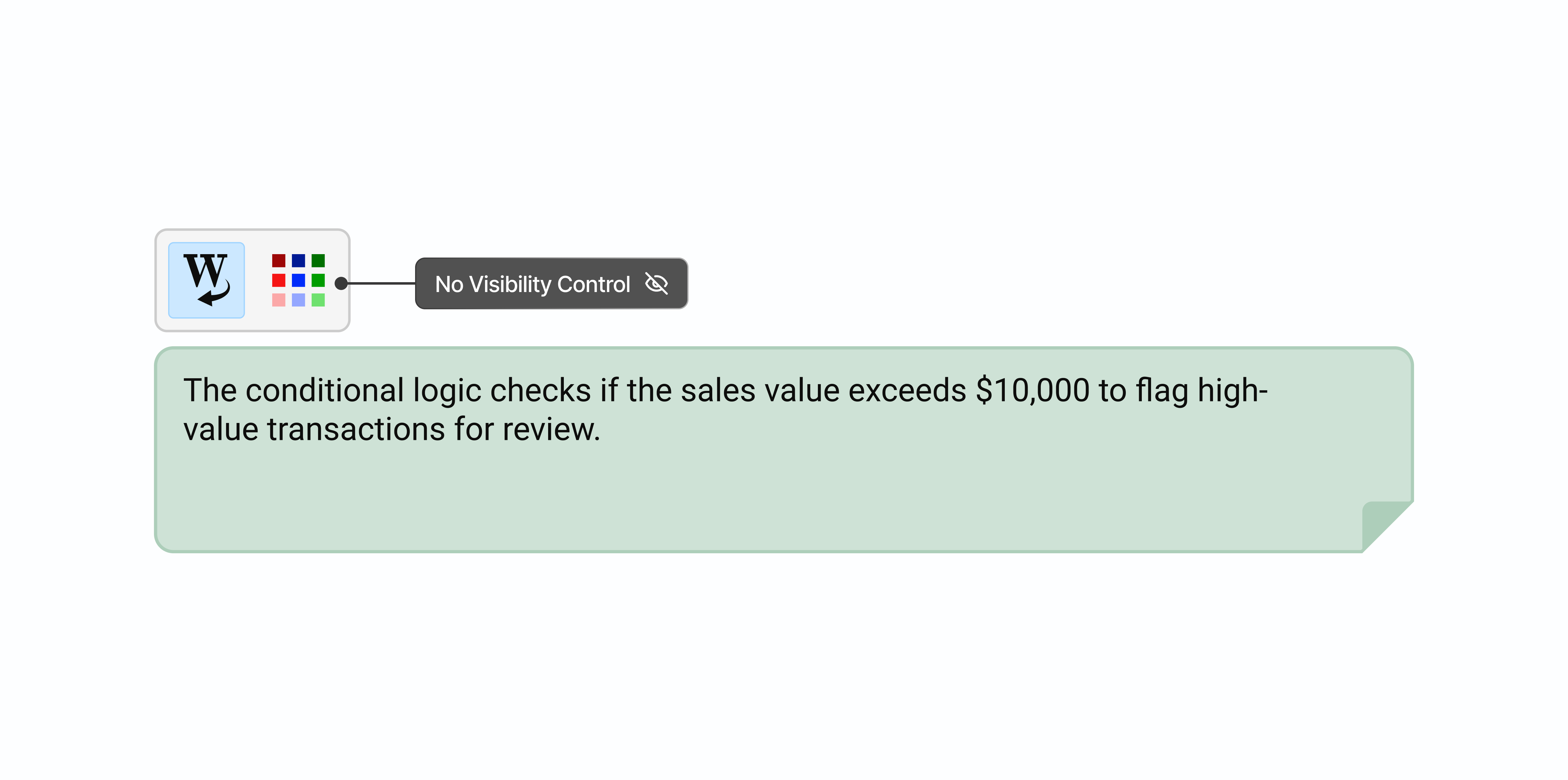
No visibility controls.
Annotations were essential for adding context, but as workflows grew larger they became a source of clutter. Users had no way to hide or collapse them, so the more documentation a workflow had, the harder it became to read.
And when they were visible, they still weren't enough.
Summary annotations describe what an object does, but not why it's configured a certain way. Users had to write their own custom annotations just to fill in the gaps, adding more to a canvas that was already overloaded.
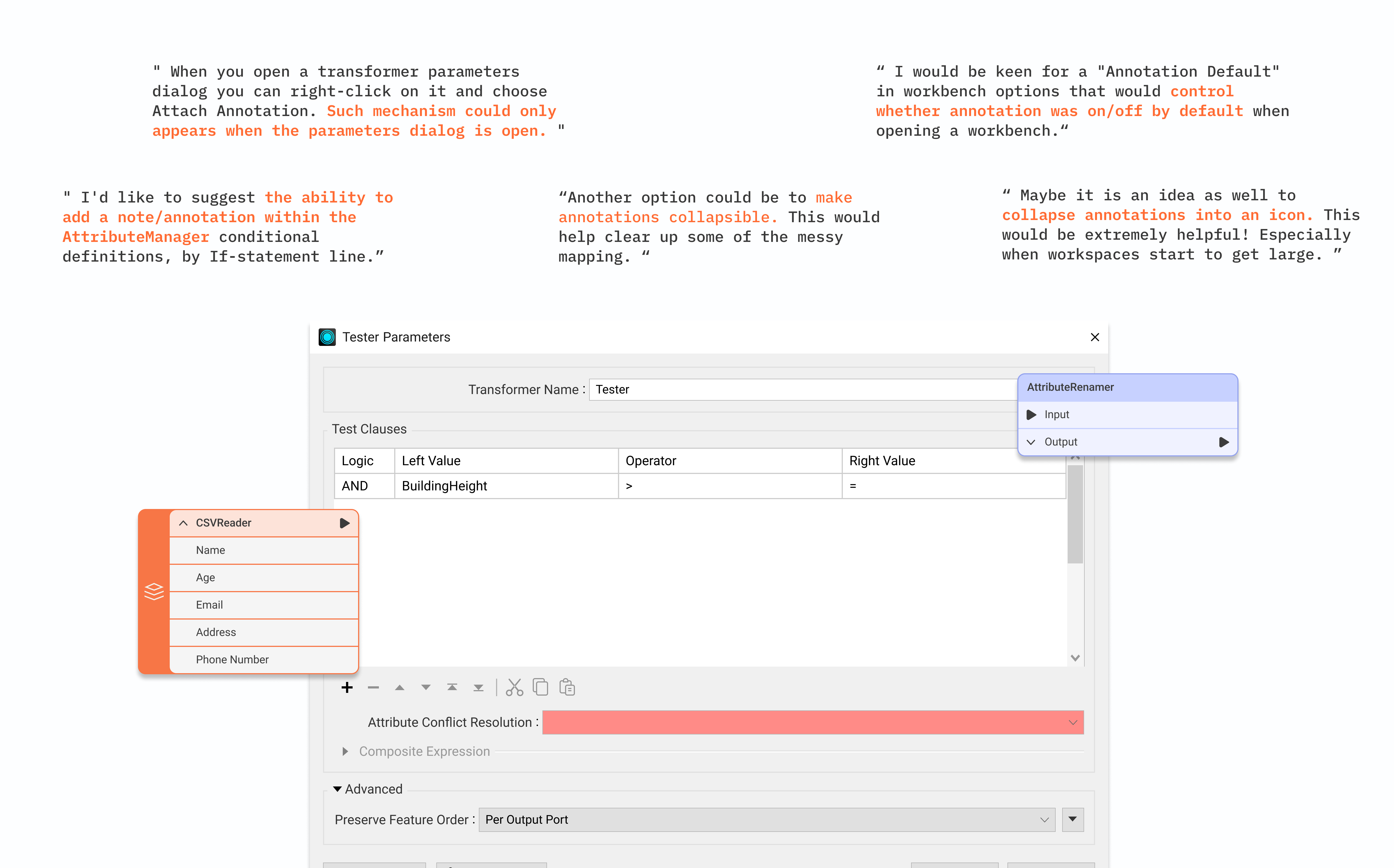
What the FME Community told us.
We pulled feedback from the FME Community platform and conducted user interviews to understand the scope. A recurring theme emerged: users wanted annotations to be collapsible and available directly inside the parameter dialog, so context stays visible exactly where configuration decisions are made.
The workaround told us everything.
We found users tucking annotations into bookmarks just to collapse and hide them. It kept things tidier but added friction and stripped away context. It was a clear signal: the need for visibility control was real, and users were paying a cost every time they worked around it.
Creating a more comprehensive annotation experience.
Following our research, the team identified two potential solutions.
Dynamic Visibility.
Let users toggle annotations between expanded and minimized states directly on the canvas.
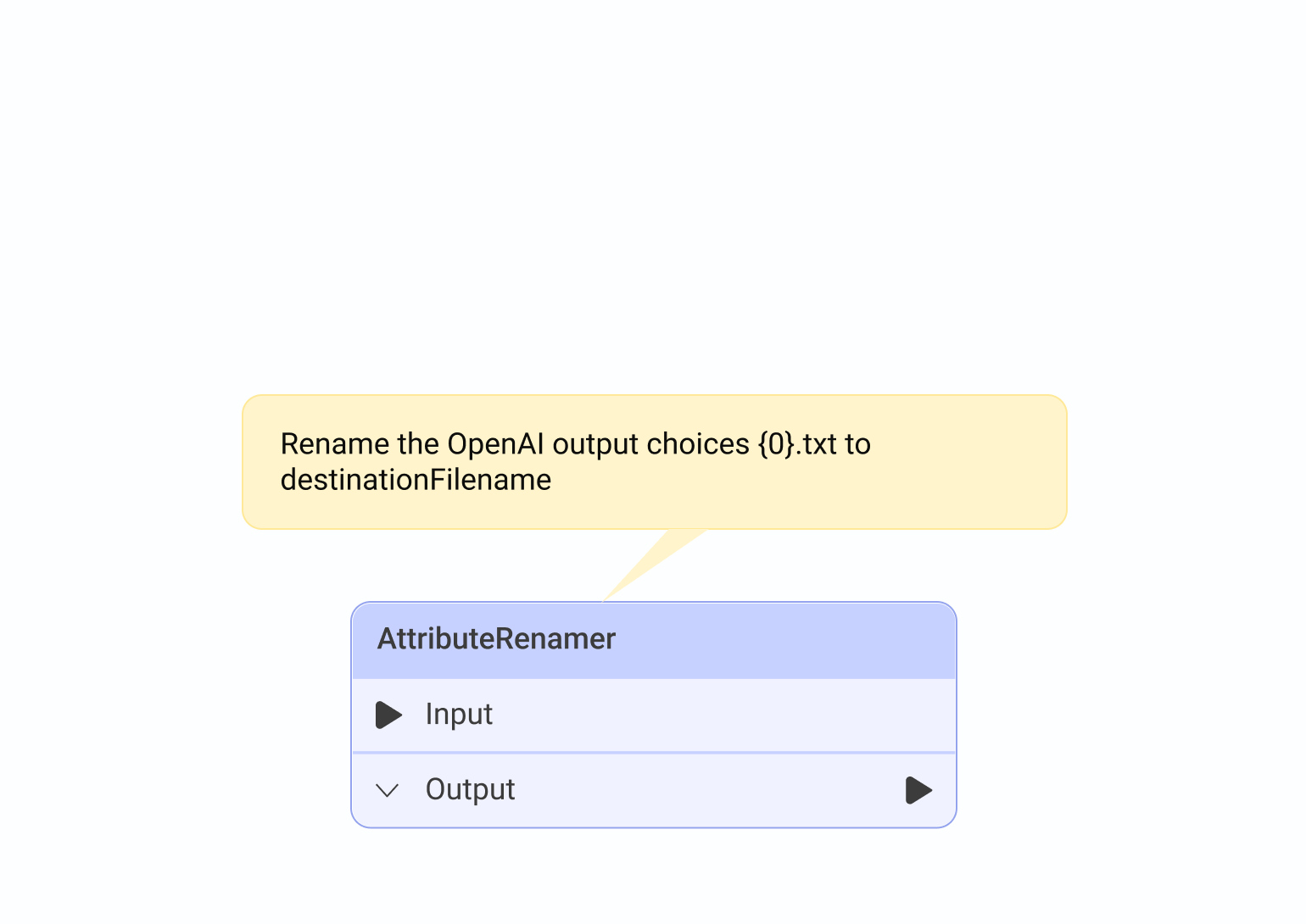
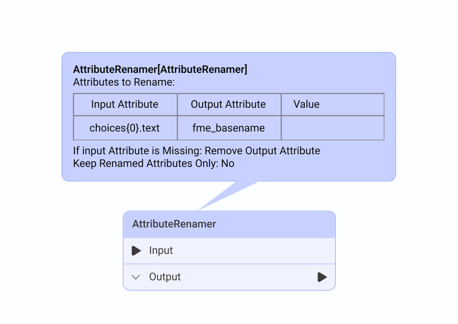
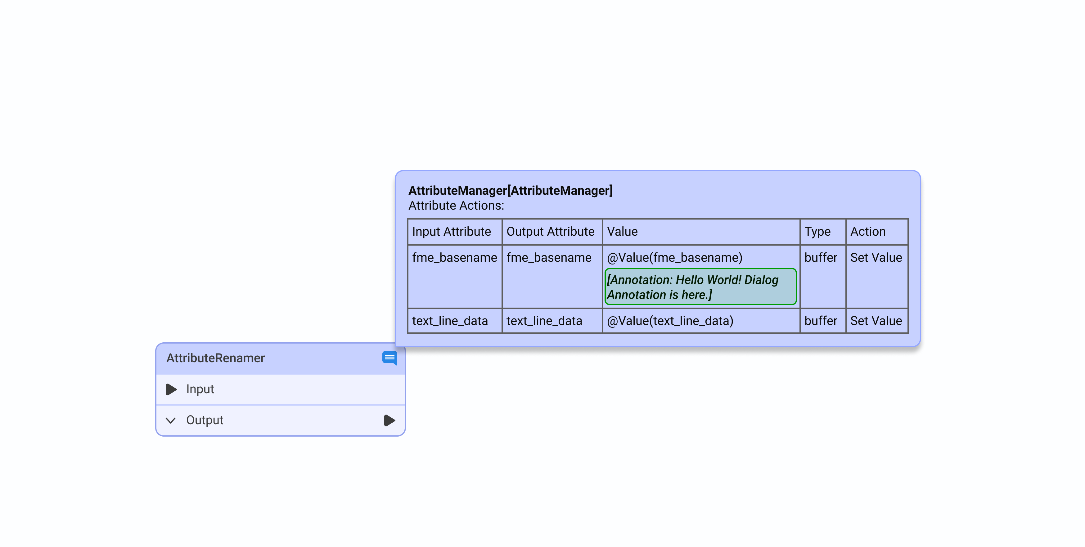
Annotation in Parameter Dialog.
Bring notes into the parameter editor, so context lives right where configuration decisions are made.
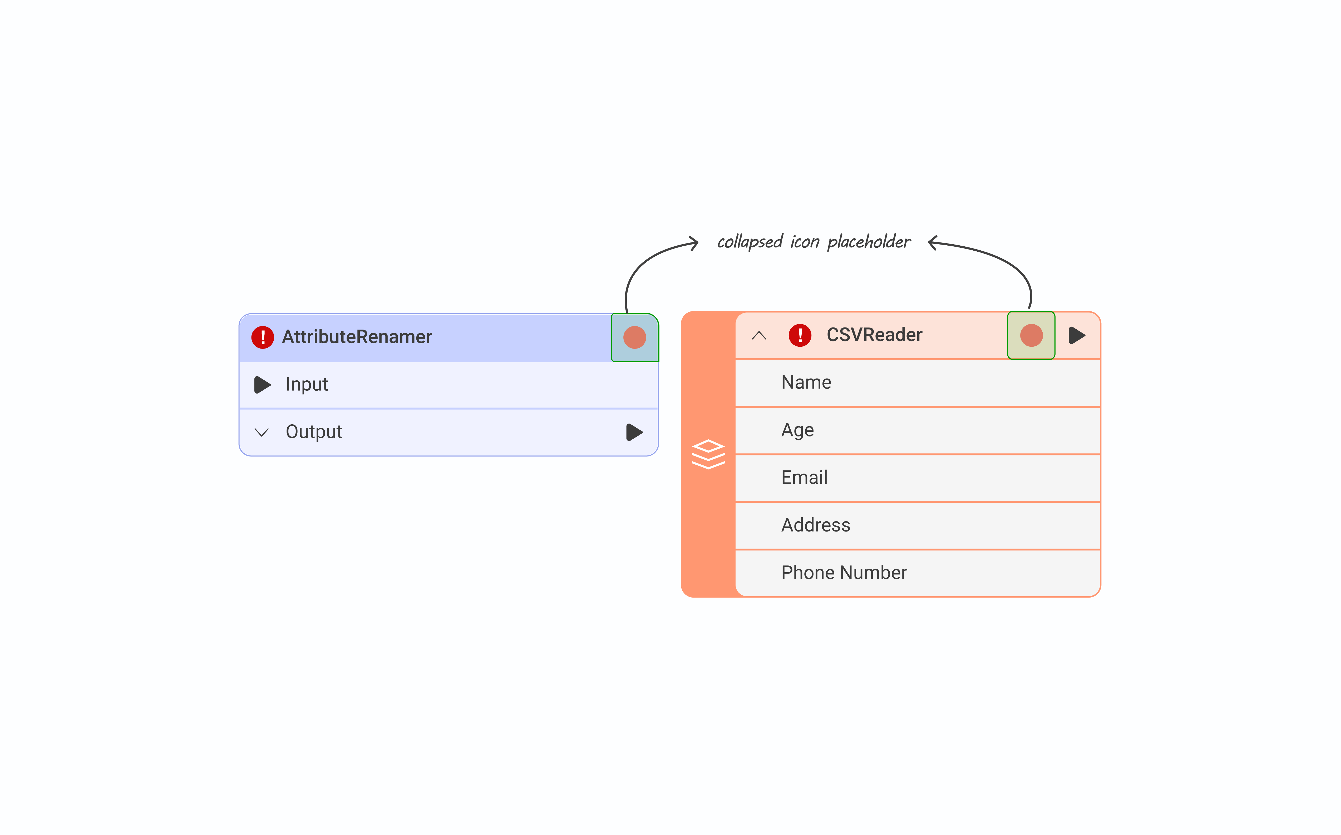
Where does a collapsed annotation live?
We mapped the current canvas object layout and found the right side of the object header was the only viable spot. The left was already reserved for alert and warning indicators.
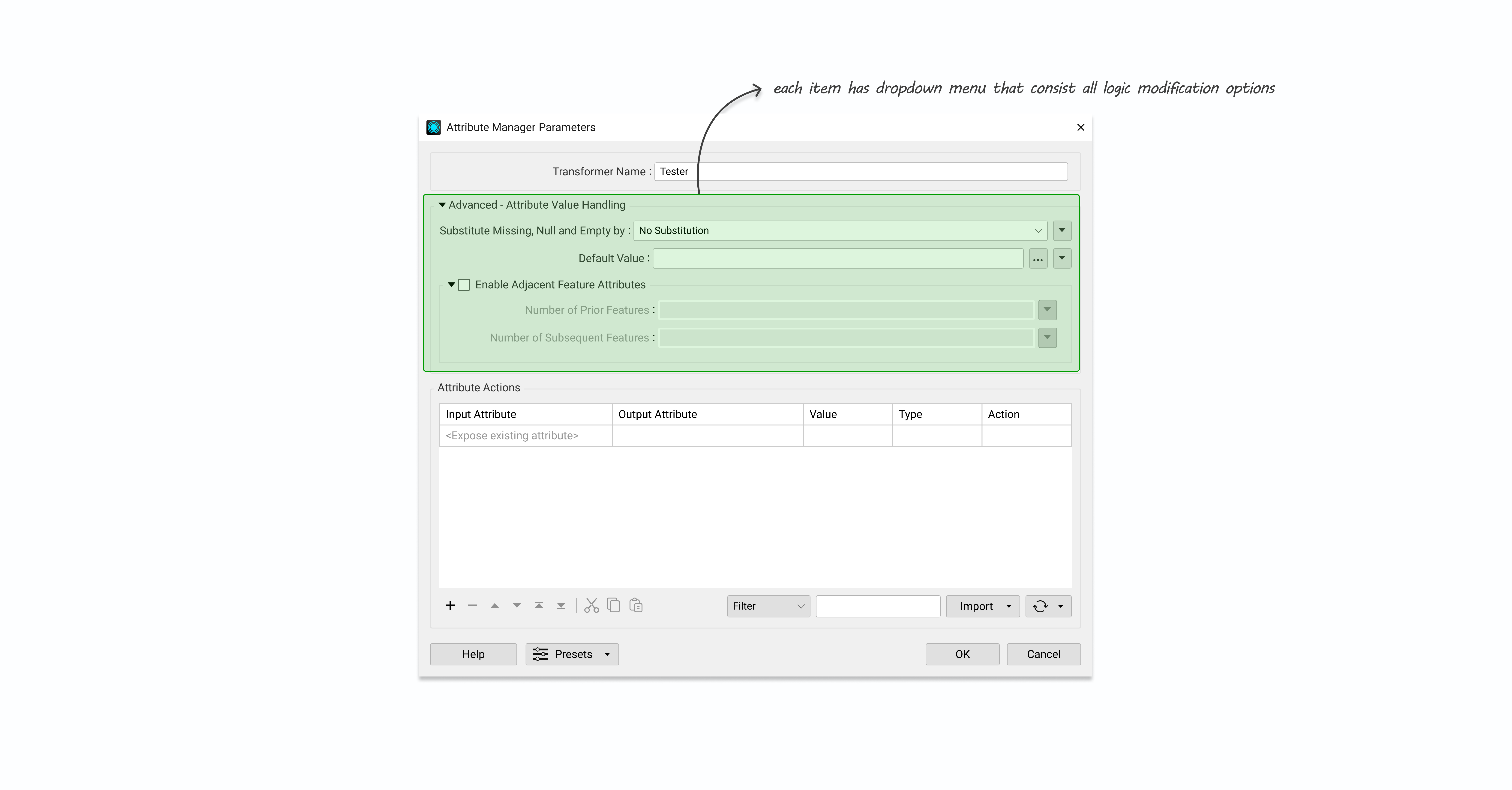
Where does an inline annotation fit?
For the parameter dialog, we placed the annotation option inside the existing dropdown area where users already define parameter logic. It fit naturally into a workflow they already understood.
Annotations can now be collapsed.
Users can minimize any annotation into an icon on the object header, keeping the canvas clean without losing access to the context.
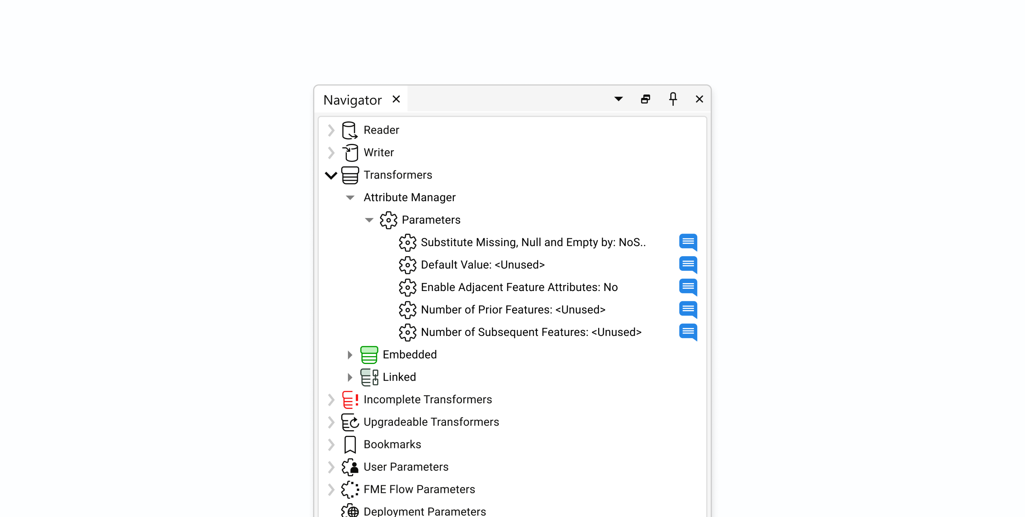
A single place for all annotations.
I grouped all annotations under a single side panel, giving users a way to navigate between them quickly without having to hunt through the canvas. Each annotation is color coded to show whether it's custom or summary, and which object it's attached to.
Context lives where decisions are made.
Users were constantly switching between the canvas and parameter dialogs to reference their notes. Bringing annotations directly into the dialog closed that loop entirely.
Design evaluation and stakeholder feedback.
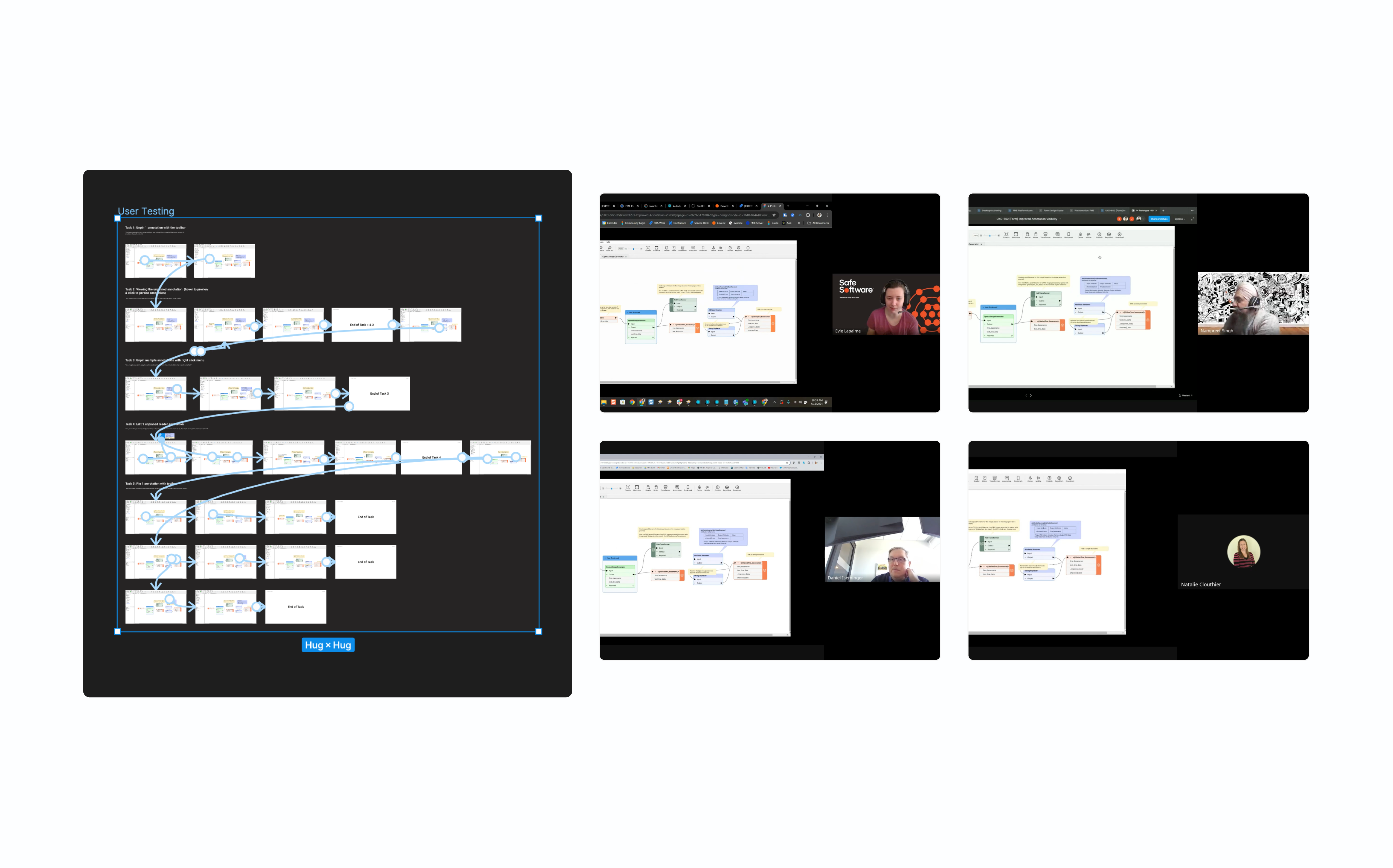
We used storyboarding to walk PMs and engineers through the proposed flow and interactions, gathering feedback and opportunities to improve before moving to higher fidelity.
Showing annotation on a different level.
Annotations inside the parameter dialog weren't getting enough visibility on their own. We explored surfacing them at both the group and canvas levels using icons and formatted text as indicators, and brought them into the navigator so users could locate annotations quickly without digging through the canvas.
Putting the design in front of real users.
We ran qualitative usability tests with four customer success team members experienced in FME Workbench. Using detailed test plans and an interactive prototype, we gathered feedback on usability and functionality. Participants completed 96% of the required tasks and indicated that the feature would provide meaningful value in their day-to-day workflows.
57% reduction in visible canvas clutter.
Post-launch, users navigated and read complex workflows more efficiently. For the first time, they could add context exactly where configuration decisions are made, without it spilling onto the canvas. The response from the community reflected that.
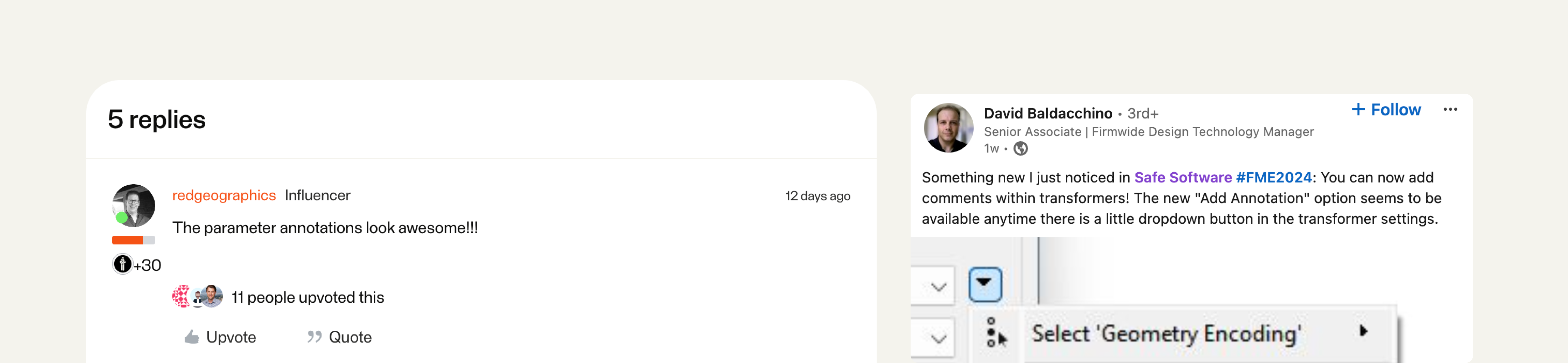
User reactions on LinkedIn following the release.