The Design System That Kept AMD's Team Aligned
No system, no standards, and a full redesign on the horizon.
When I joined AMD's UX team, the product didn't have a shared design foundation. Designers organized files differently, colors were applied inconsistently, and components varied from screen to screen. The team was also preparing for a full software redesign, which meant the inconsistency wasn't just a current problem. It was about to be a much bigger one. I took on building the design system from the ground up, not as a cleanup effort, but as the structural layer the redesign would be built on top of.
Three things it had to solve.
With a clear direction established, I outlined three goals the design system would need to support:
A consistent design foundation.
Standardize components and bring visual consistency across the product.
Faster design-to-dev handover.
Reduce back-and-forth with a shared system both sides can reference.
Built to scale.
Support the upcoming redesign without needing to be rebuilt from scratch.
Auditing the existing product before building anything.
Before building anything new, I audited the current product to understand what we were working with. Two issues surfaced immediately. Colors had no shared source of truth — the same UI state could look different depending on who built it, creating a broken visual hierarchy. Components had the same problem. Buttons alone varied across screens in corner radius, spacing, and weight, with no documented standard to reference. Without a governance layer, every designer made independent decisions, and the product drifted further from consistency with each new screen.
Inconsistent color application
Inconsistent component styling
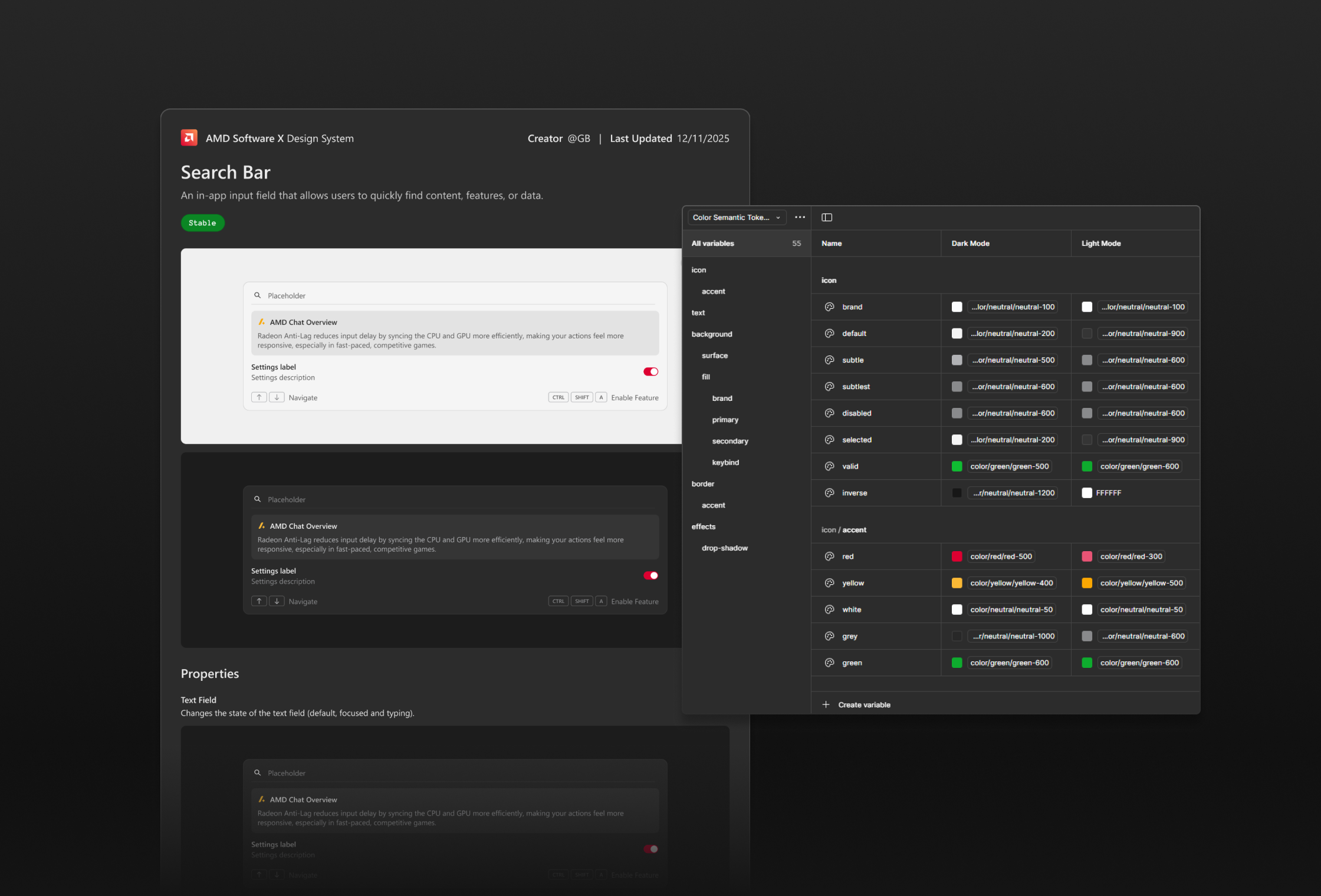
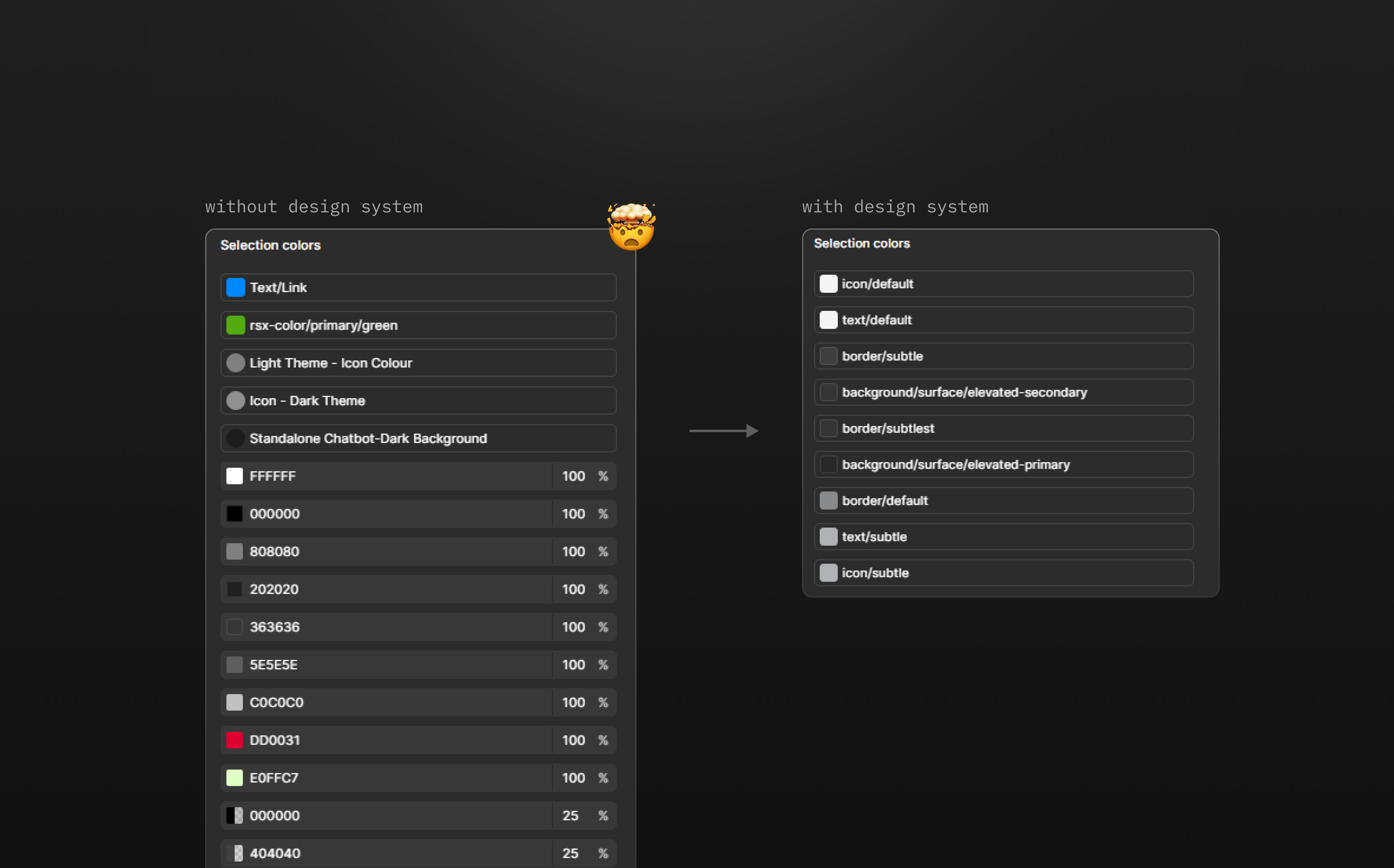
A better color foundation.
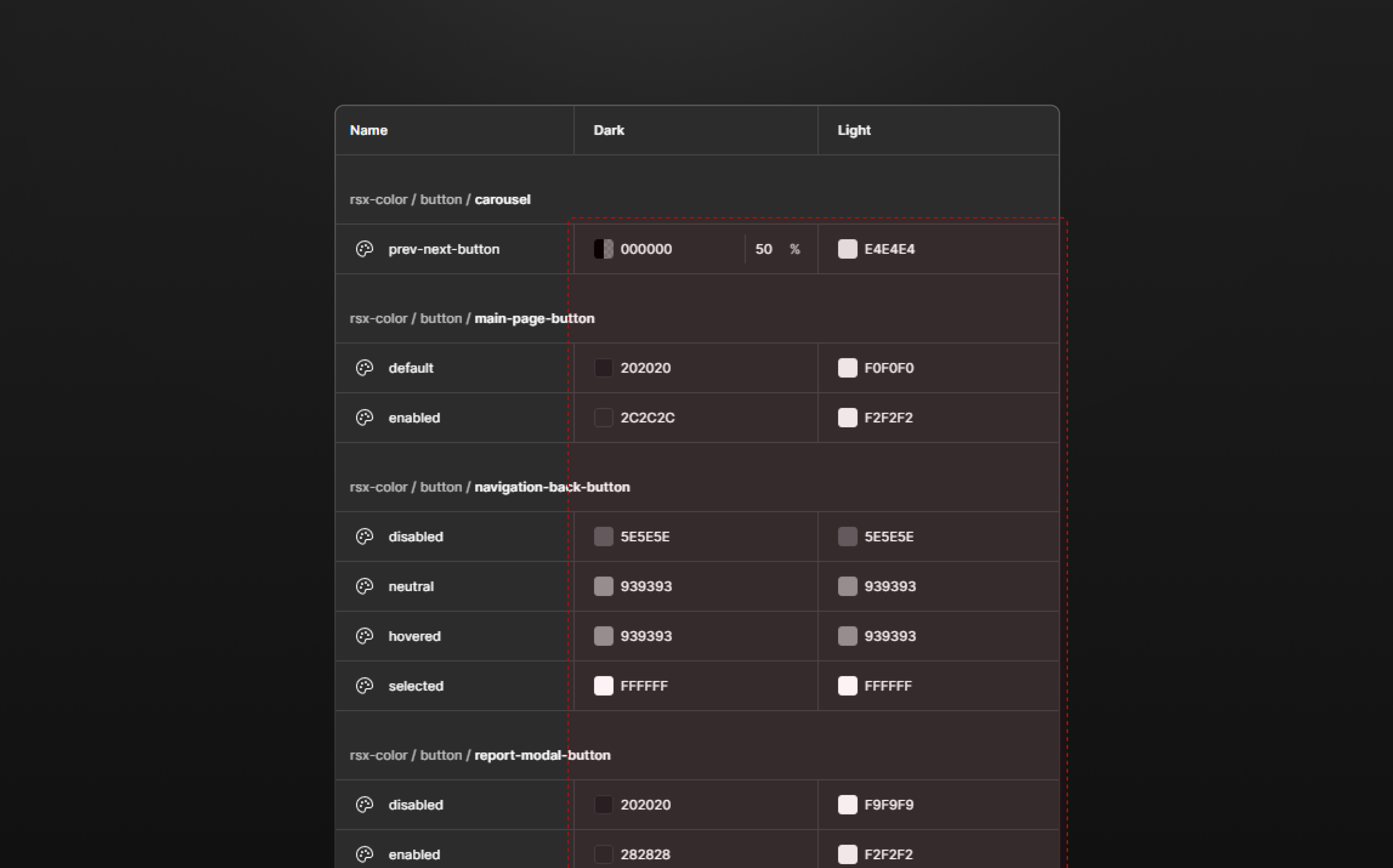
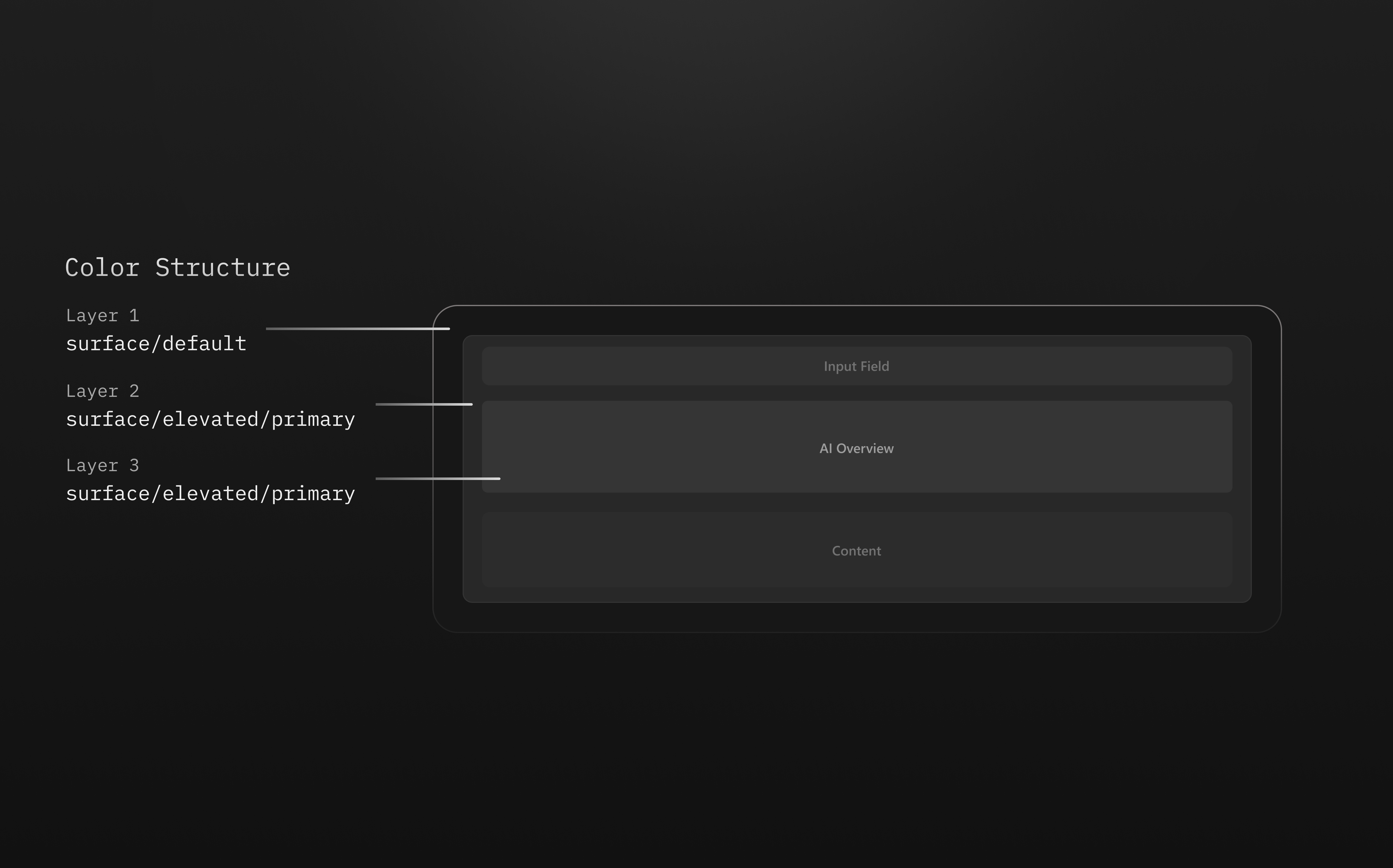
I defined primitive tokens as the raw color palette and mapped them to semantic tokens applied across components. Components reference intent-driven values instead of hardcoded hex codes, so a single update propagates everywhere it matters.
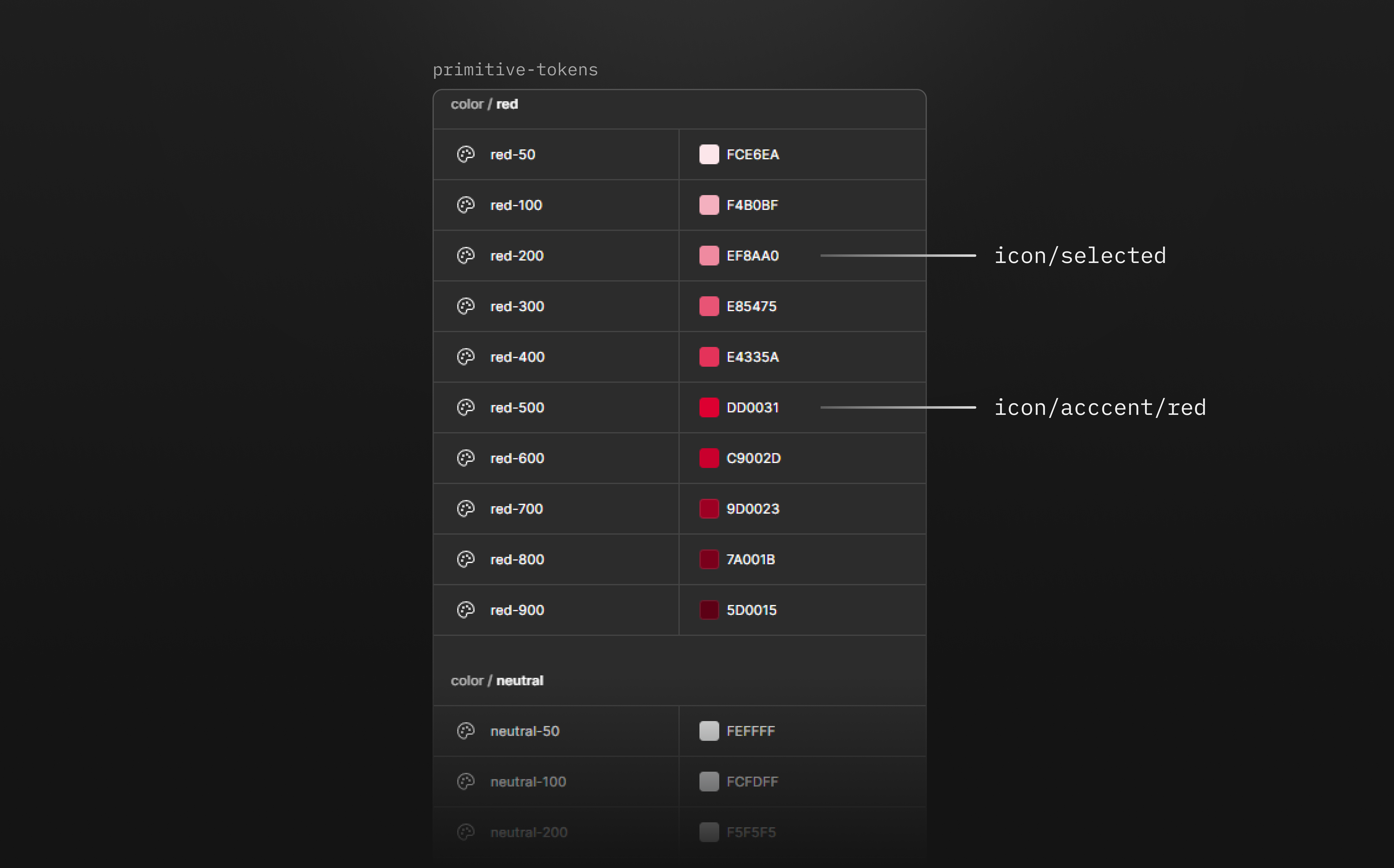
Once the primitives were set, I mapped them to semantic tokens named by purpose or state. Components always reference role-based values, which made global updates straightforward and kept the system from drifting as it grew.
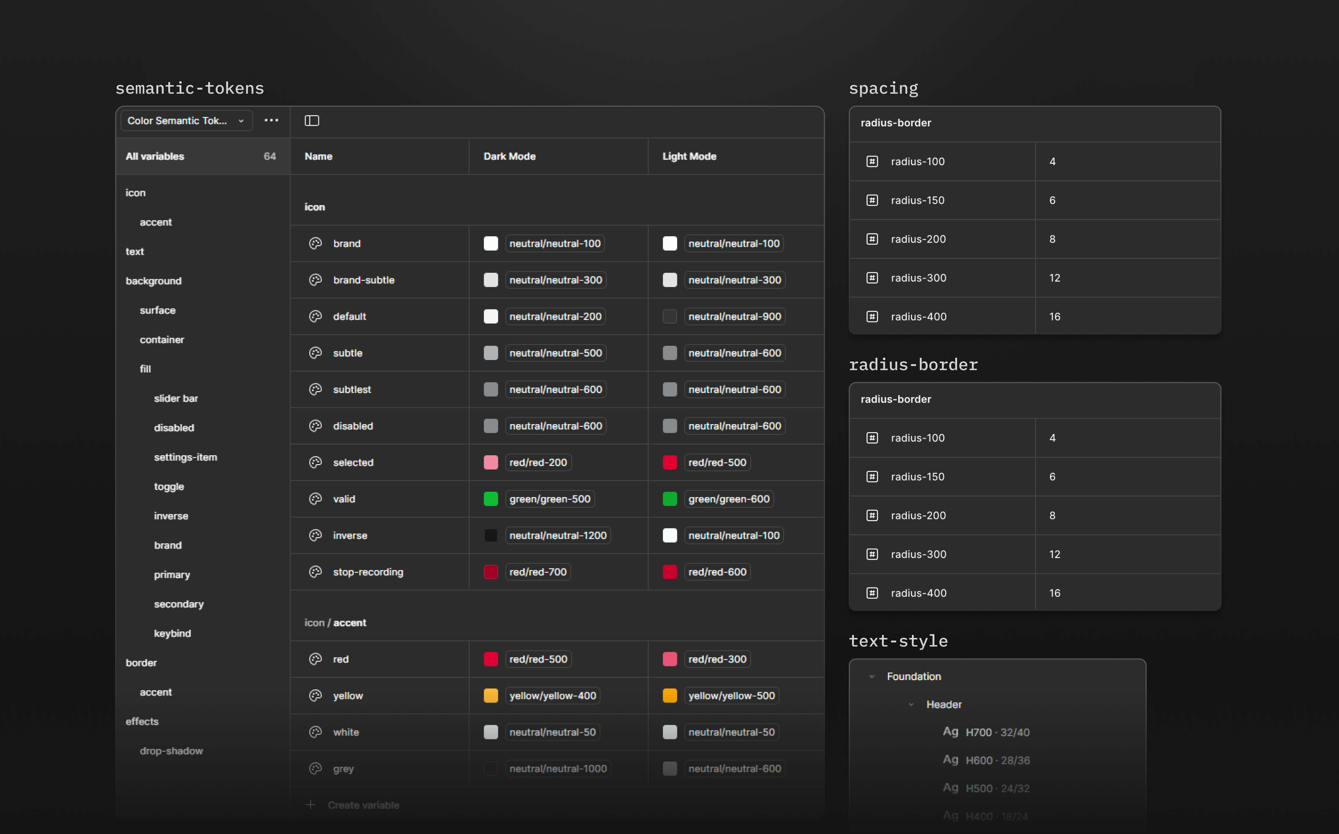
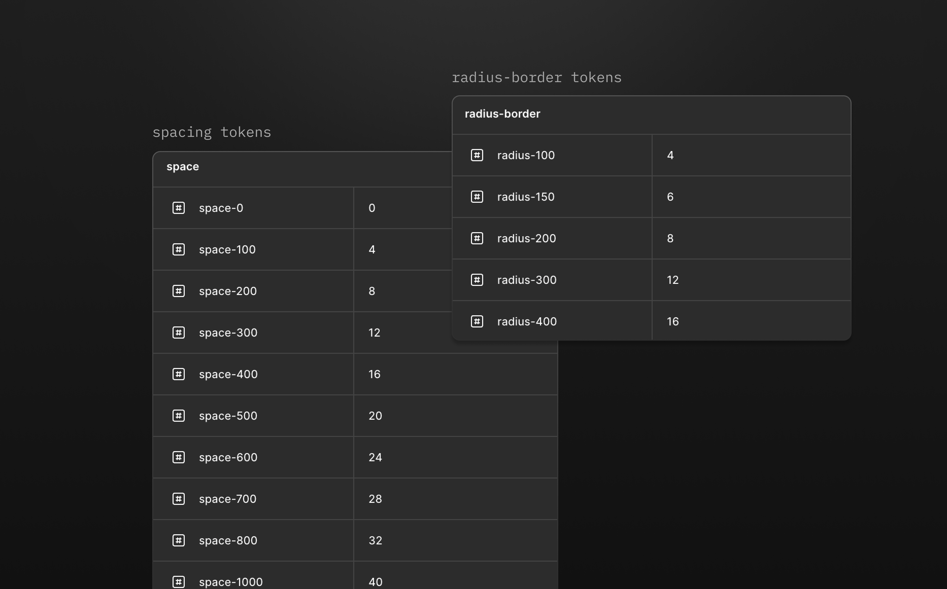
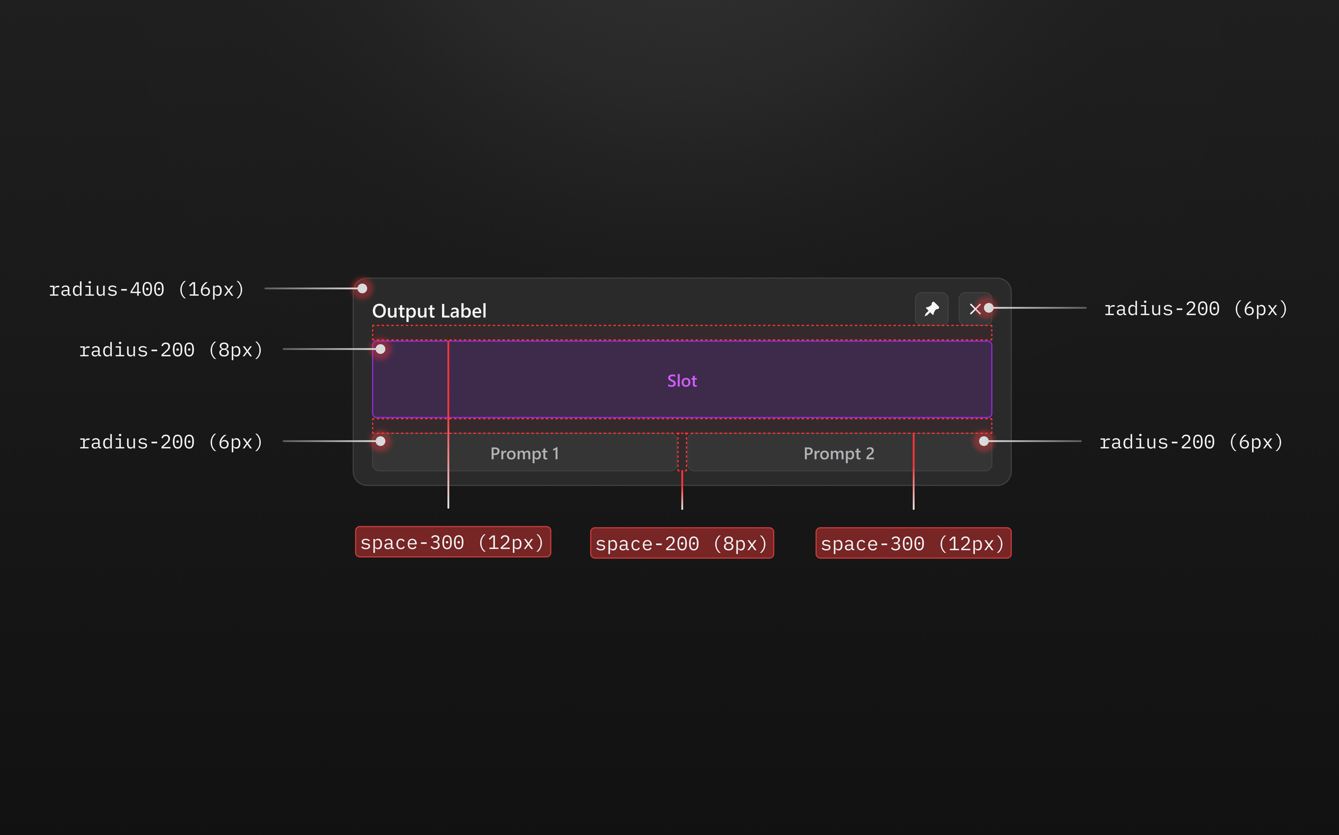
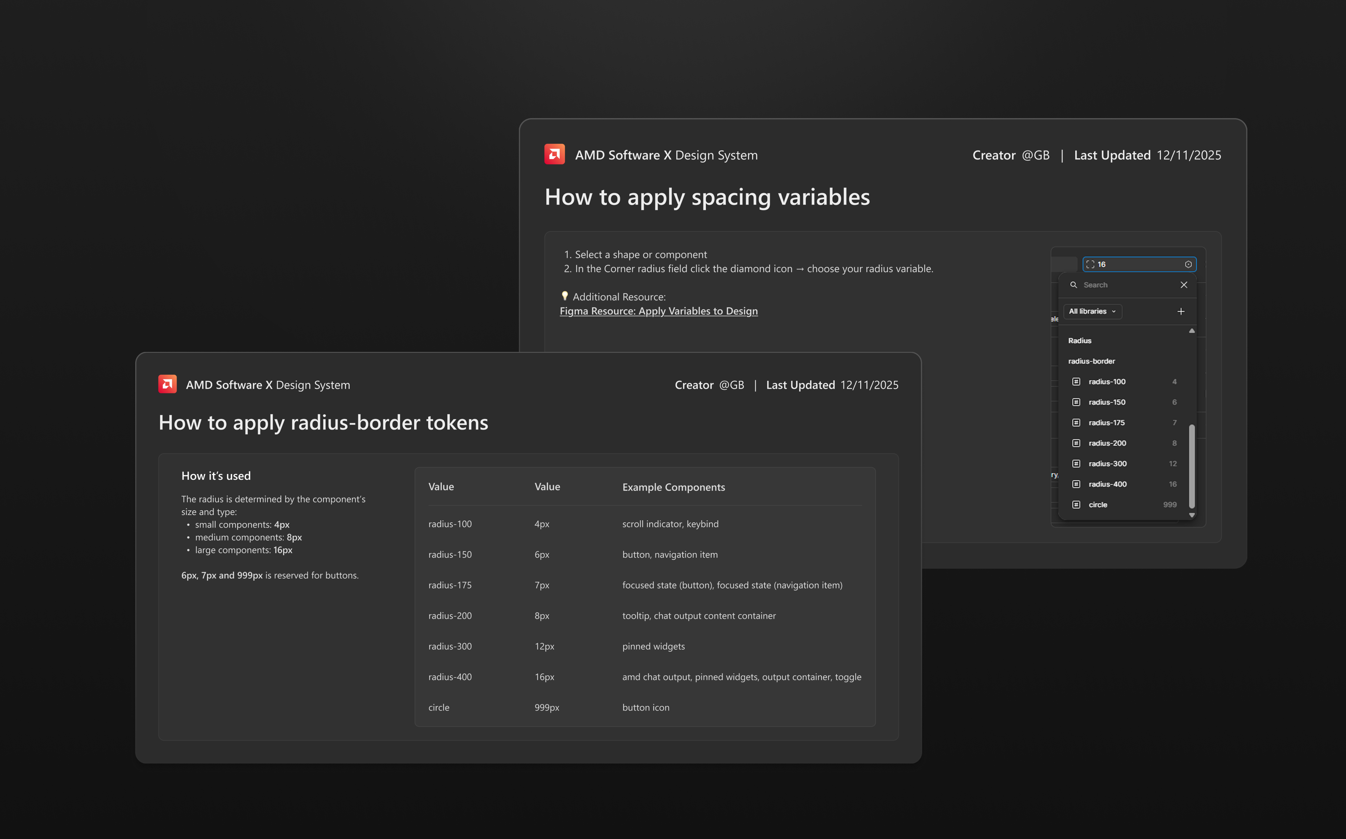
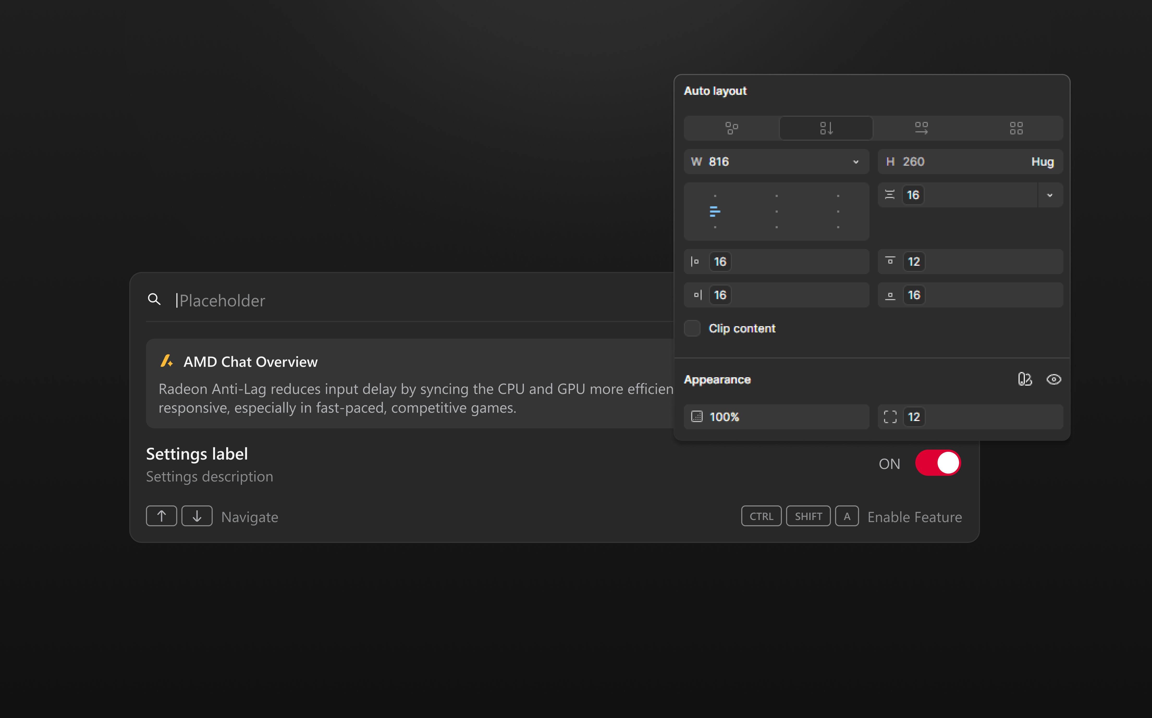
A spacing and radius token system.
I introduced numeric tokens for spacing and radius built on a 4-point scale. Layout decisions became consistent across the board, and adjustments no longer required guesswork.
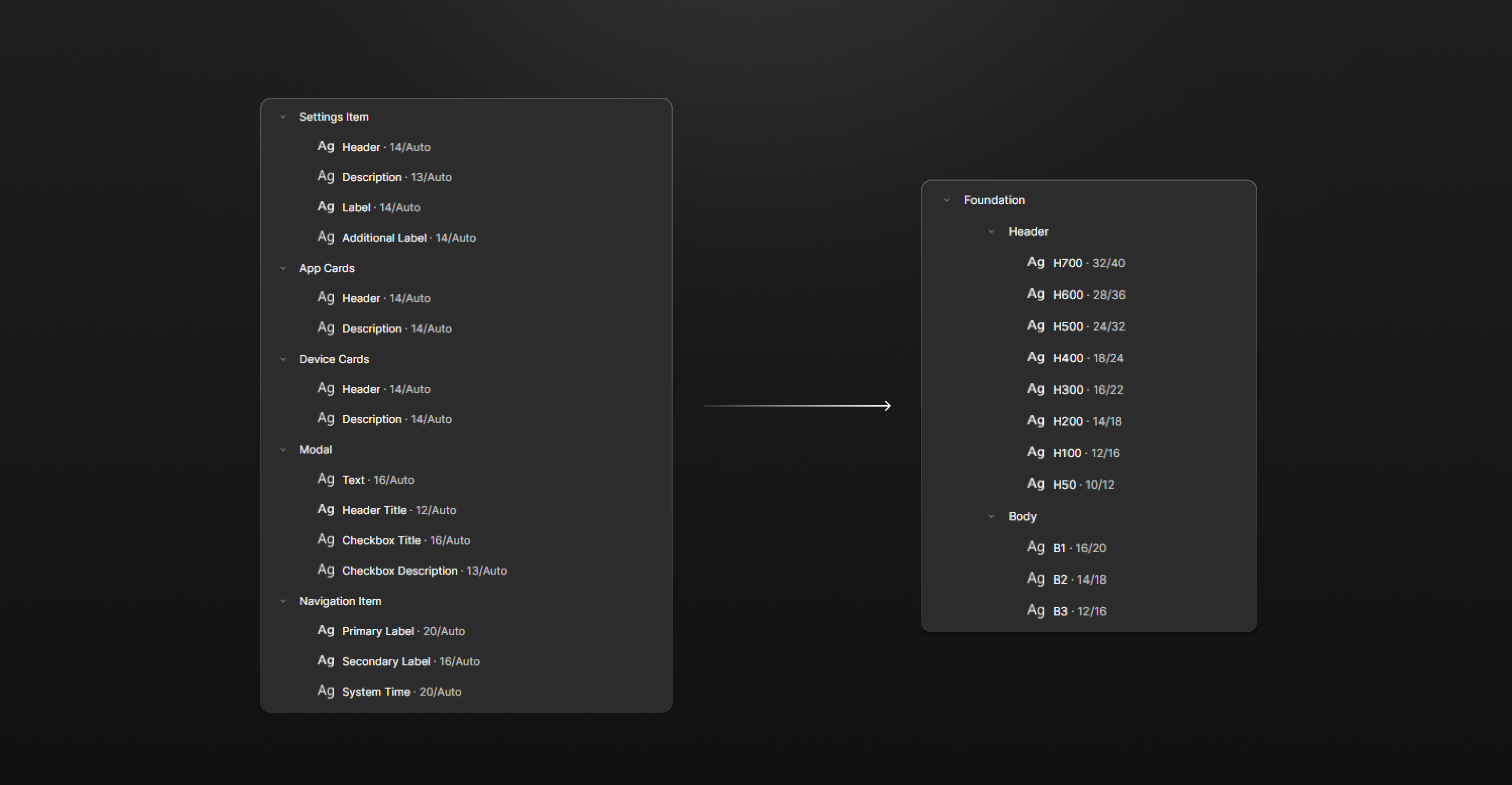
A unified typography scale.
Text styling was scattered across files with no shared structure. I consolidated everything into a single scale with clear header and body levels, so type decisions were predictable and easy to apply consistently.
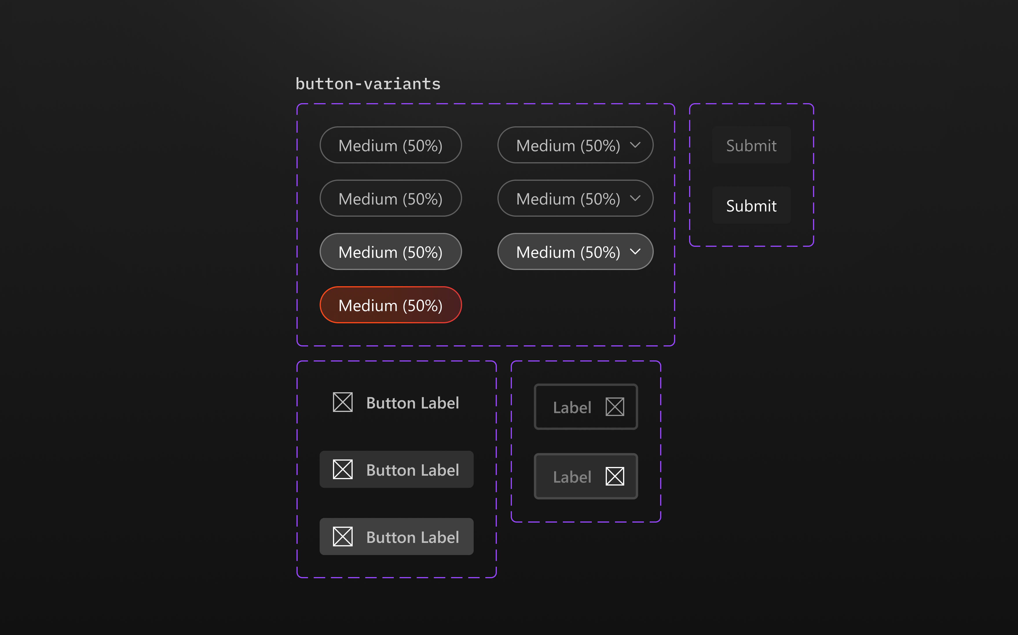
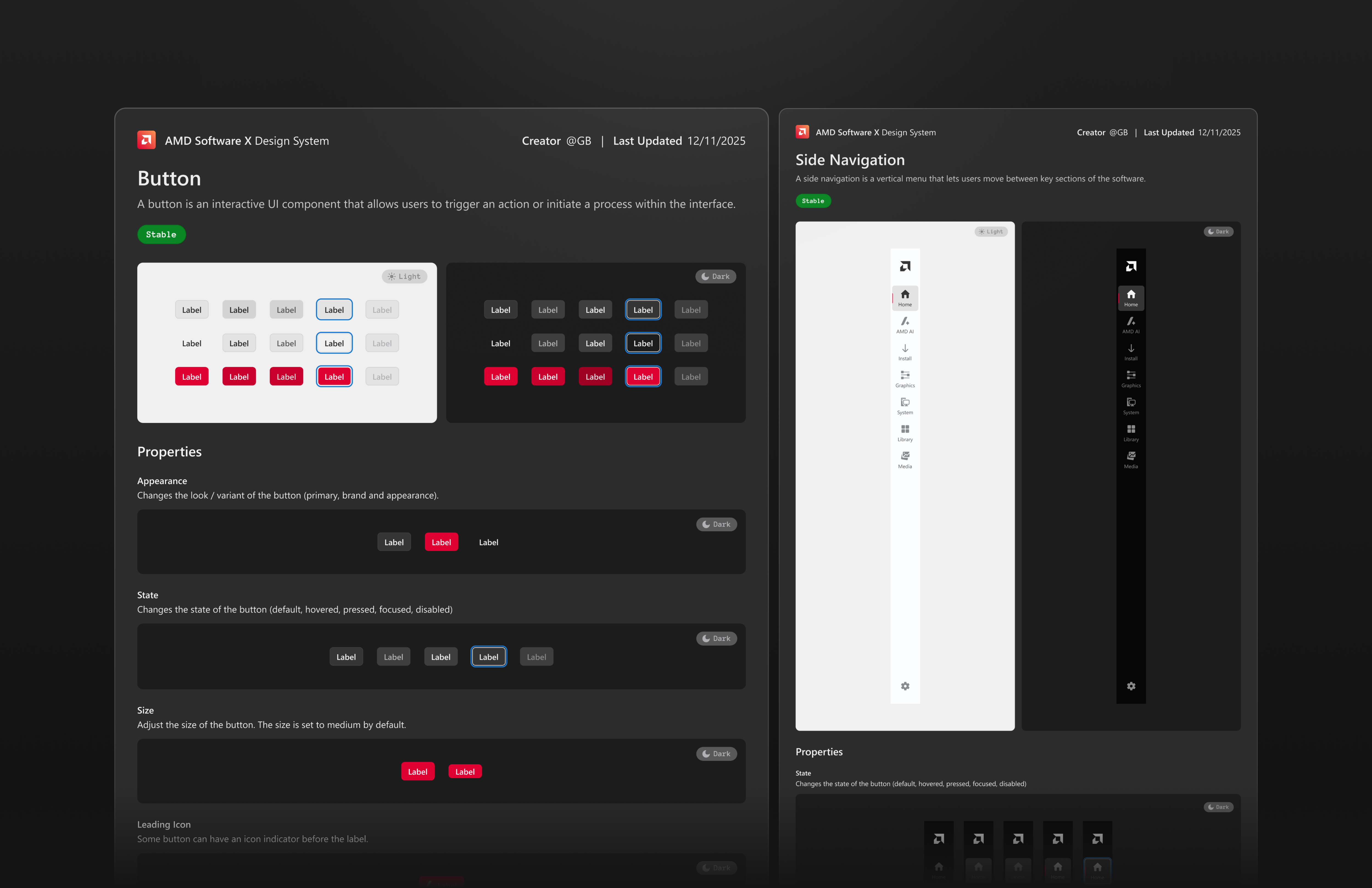
Starting with the essentials.
I began with the most-used components — buttons, navigation, inputs — and built outward as designs got stakeholder approval. Starting small kept the system manageable and let me validate the token layer before scaling.
Breaking complex components down.
As more patterns were approved, I expanded the library and decomposed complex components into smaller, reusable parts. This improved flexibility and made the system easier to maintain as it grew.
Tokens all the way down.
Every component references tokens, never hardcoded values. As the system matured, I defined the rules behind each one — which radius applies at which nesting level, how spacing scales across sizes. Updates propagate everywhere without breaking anything.
Color assigned by role, not by eye.
With semantic color tokens in place, assigning color to components became a decision about intent rather than picking a hex. The same component automatically adapts when the token it references changes.
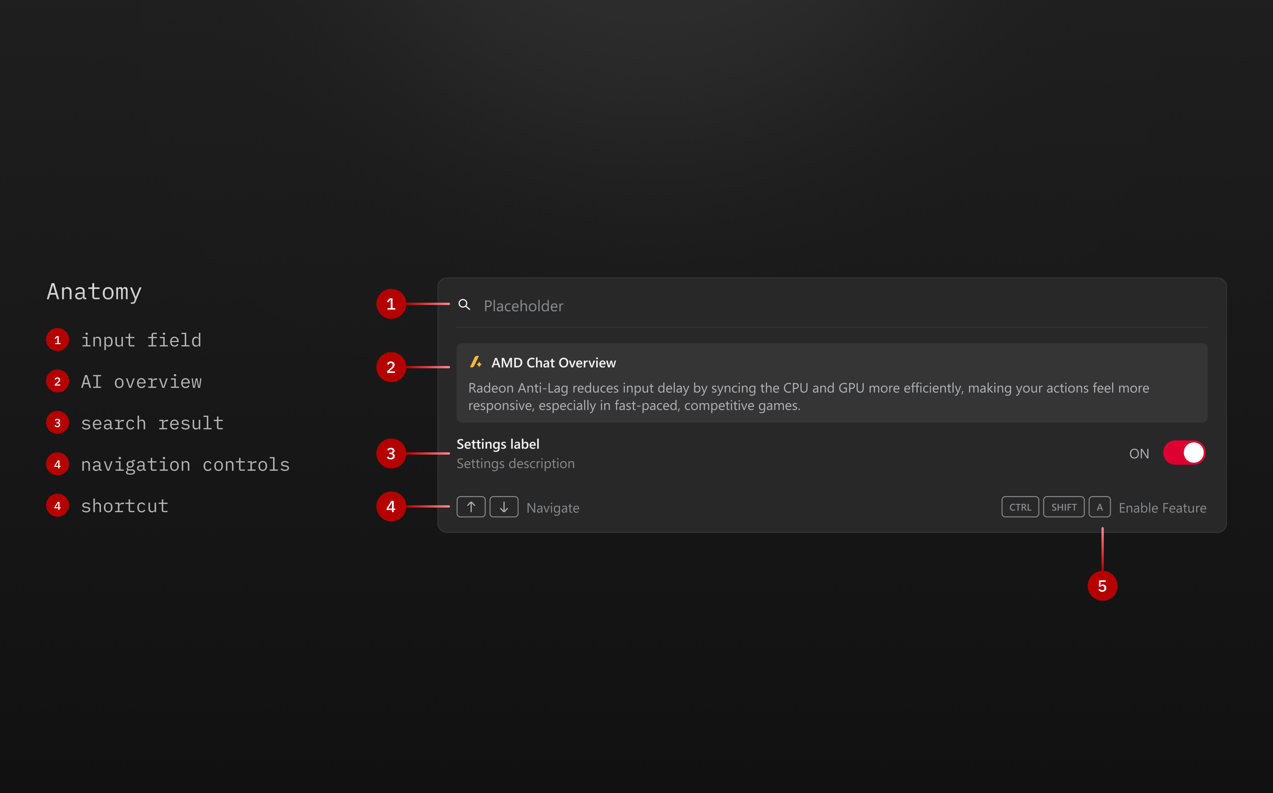
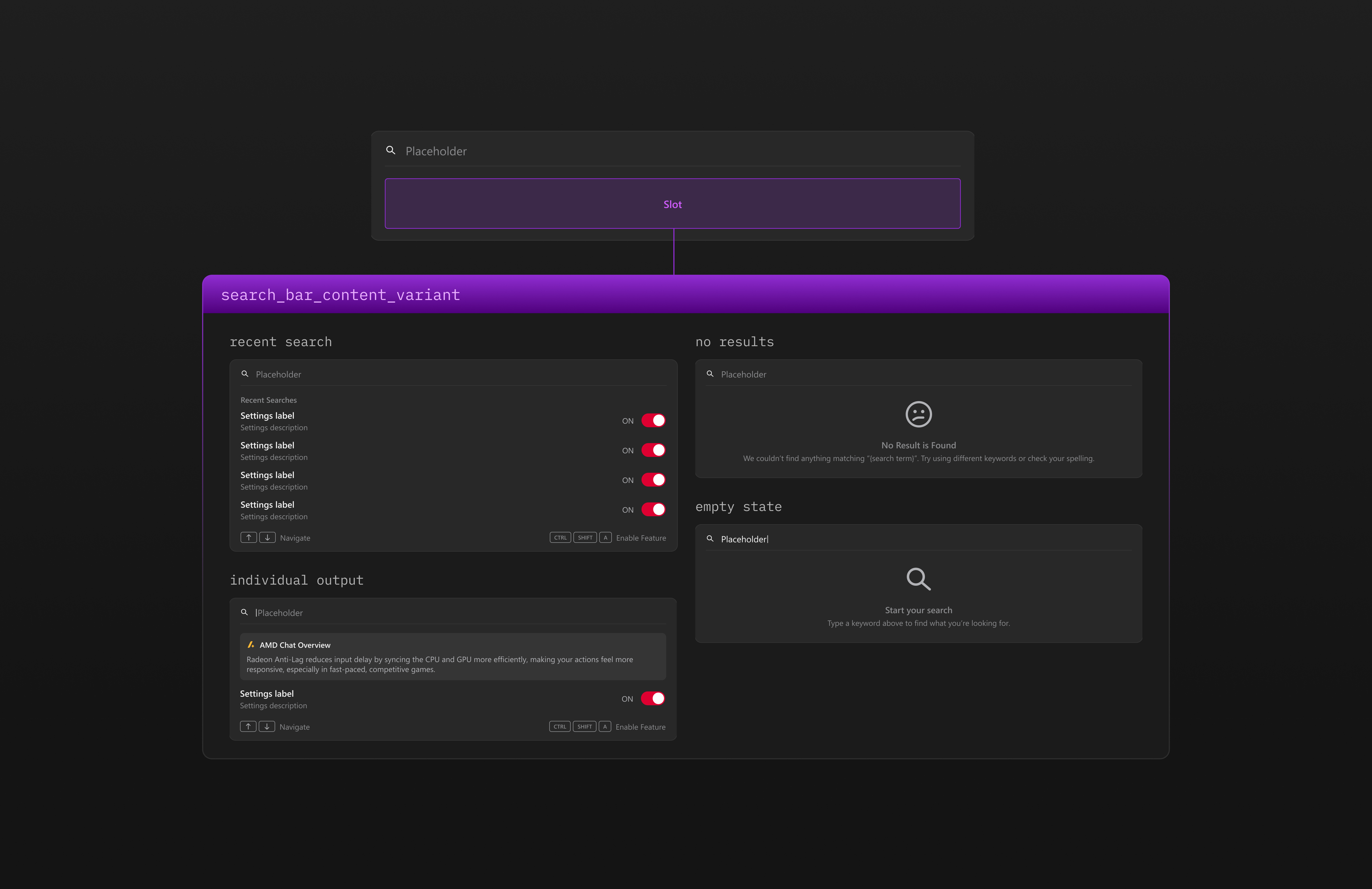
Slots instead of endless variants.
Rather than creating a new variant for every content combination, I used slots as flexible placeholders. Components stay consistent in structure while adapting their content without multiplying the variant count.
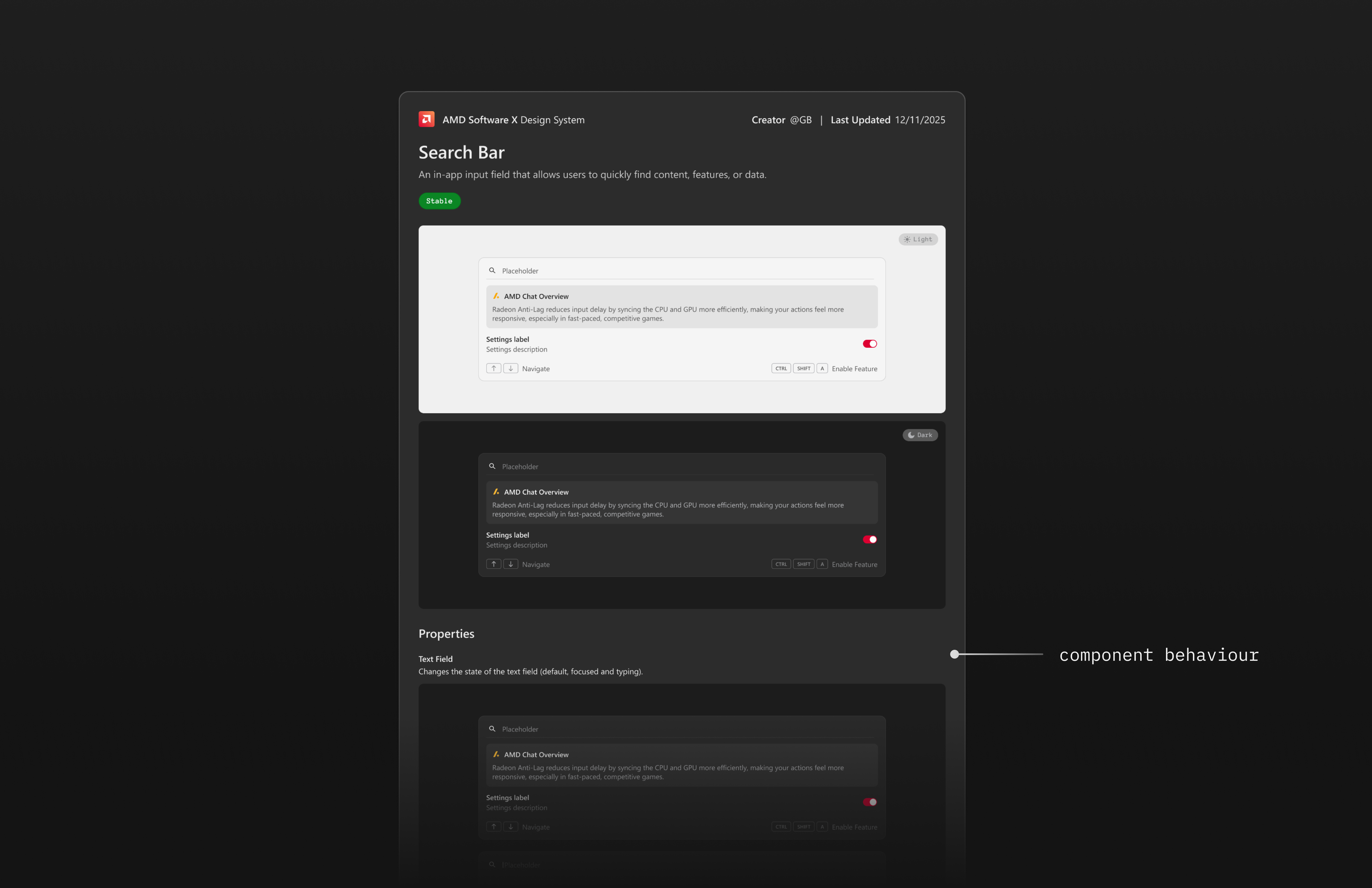
Closing the gap between design and development.
Wrote usage and behavior guidelines for each component. The goal was simple: designers and developers shouldn't have to chase each other down to figure out how something is supposed to work.
Built it. Then got the team to actually use it.
By the end of the internship, the team had a working system they could actually build with. Updates propagated cleanly across mockups, designers stopped guessing at spacing values, and the redesign had a consistent foundation to grow from. Beyond building the system, I took on getting the team to actually use it. That meant running walkthroughs, answering questions during handoff, and making sure designers felt confident reaching for the system instead of going off on their own. Adoption was the real measure of whether the work landed.
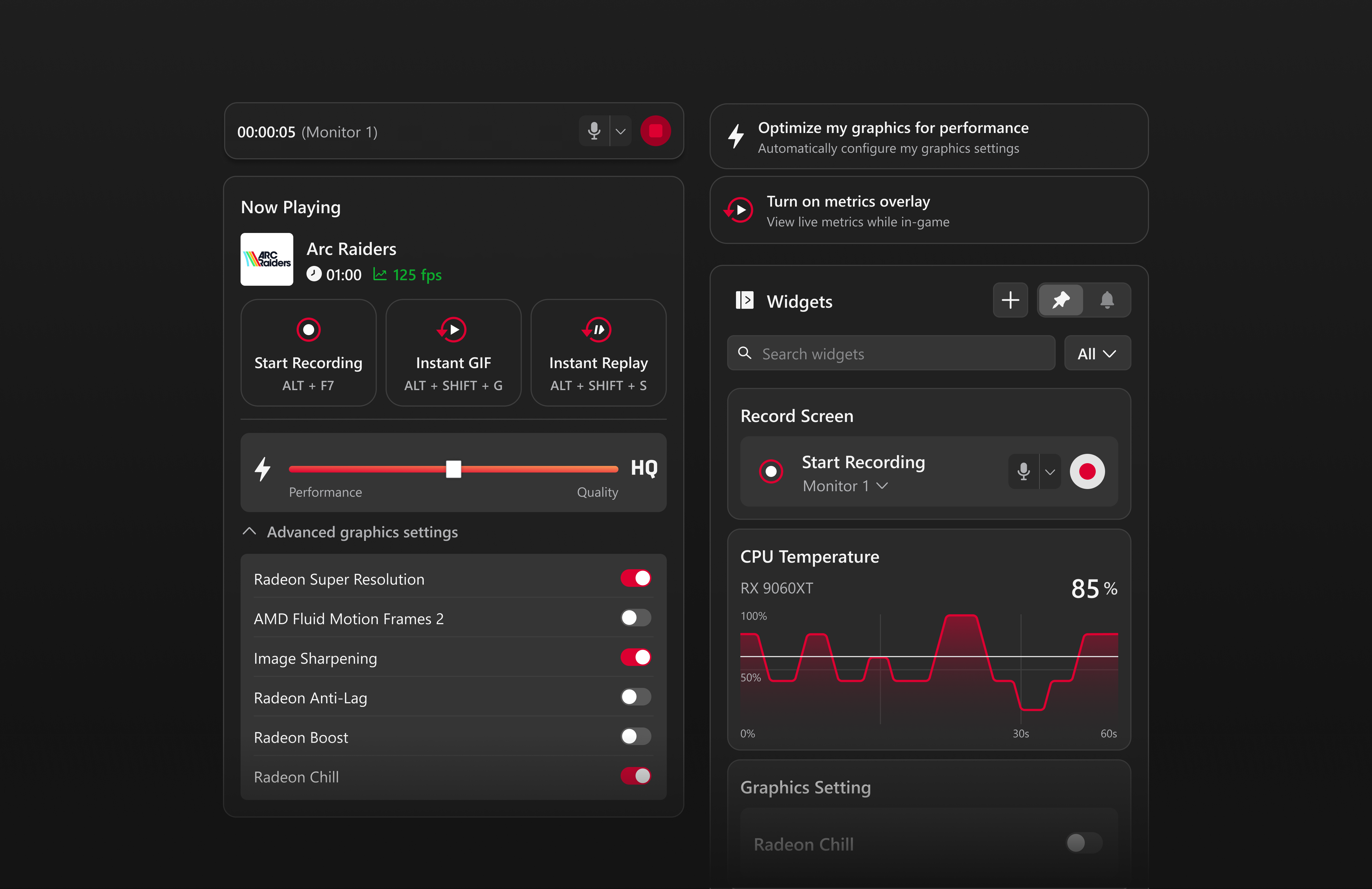
Rethinking the Overlay as a Control Surface
The design system was built to support this major redesign initiative! A full redesign of the AMD Software overlay, turning a read-only metrics display into something users could actually act on.